Saturday, December 19, 2009

Christmas Time!

Because it is almost Christmas, of course my blog is going to have to get into the spirit. For some reason the quality on these really sucks, but it's better if you click on them. I edited all of these at home and my dinosaur version of photoshop wont let me make contact sheets, so this is all I've got for now. Enjoy :)

I really like the idea of putting a few pictures in one, kind of like a photo montage. I think the first one is kind of neat because I messed with the focus. In the picture on top the bell is in focus and the cat is out of focus, whereas on the bottom it is exact opposite. With all of these I made a gradient map in a new layer with orange and blue and decreased the opacity to give it that color effect.


one place I got some inspiration from is
http://www.deviantart.com/#catpath=photography&order=9&q=christmas

Friday, December 18, 2009

surrealism ideas


That's an apple house :D


something with balloons, balloons are fun.


Wednesday, December 9, 2009

DINGDING! Idea

So the other day I was sitting around, trying to think of some ideas for my final project for first semester. It has to be a series, and a really random thought came to mind. Scars. I could take a picture of people's scars with good stories behind them, take a picture of the person, and maybe have a little quote next to them, from the story they tell me about their scar. I had it all panned out in my head and thought "wow, this could be pretty sweet". So today I decided to try it out and see what I could do to create this series, how the layout would be and stuff.
These are just a couple examples of what I have in mind, kind of a sneak peak if I do decide to use this idea for my final series.


Tuesday, December 1, 2009

Buff n Tuff project

FINALLY figured out how to get it on here!


Monday, November 30, 2009

Avedon

Last week I took some Richard Avedon inspired photographs.
My subjects were three of my closest friends, so I knew I could evoke at least some form of emotion out of them.
www.richardavedon.com/


William and Tyler were my challange, simply because I couldn't really get them to do much more than just sit there and do stupid things in front of my camera. So for these I just stoped taking pictures for a while and we all started talking, telling funny stories and remembering stuff, then I started to take pictures when I knew they were actually thinking about something other than feeling akward infront of my camera


I chose to take pictures of Rianna simply because the second I think of expression and emotion she comes to mind. She is the most real person I know and completely comfortable with herself.
To put it simple I believe she makes for some amazing pictures


It's hard for me to think of how other people view this picture because I know her really well and I know the exact emotion on her face. But if I try to see how other people view the emotion, she's a little hard to figure out. I like this picture because I think it's a bit mysterious, and kind of makes someone want to know what she's really thinking about.


Friday, November 20, 2009

Just for fun

So yes, I know I haven't been posting blogs for the past couple weeks, but I have been working on a slide show for the viking voice website and decided I'd turn it into a two week project. I will have that up here by Monday so I can get a grade for it. But just for fun, I will post something else I've been working on just having some fun with photoshop

I was messing around with light painting and I decided it would be sweet to make one with overlapping images in layers to make a picture. It's different and I think I might do a project on this some week and cuz it was kinda fun to do and let me be more creative. Let me know if it's not as "photography related" as you'd like. Just thought I'd share :)

Wednesday, November 11, 2009

Video Week

On monday and tuesday we watched a documentary about National Geographic photographer Joel Sartore.

The video was about his photography career and also how it interferes
with his life. I think everyone who has a strong interest in photography
has wanted at one point to be a photographer for something as big as
National Geographic. Personally I think it would be an amazing job.
I love to travel and plan on going everywhere I can when I am financially
able to. The world is an amazing place and I definitely plan on taking
pictures everywhere I go. To be payed for doing something I love would
be awesome, but I also think the job would have it's downsides.
Anything as an occupation will take some of the fun out of your work.
For example, as a photographer you may love pictures you take, but
you ultimately have to go with whatever the client loves. As for being
a National Geographic photographer, you're expected to go wherever
you're assigned and to take pictures they are going to like, not go where
you want to go and take picture you like. I think it would also be very
difficult if one were to have a family, as Joel Sartore showed. Being a
traveling photographer means being far away places for amounts of time,
and it would for sure put stress on a family.

These are some of the pictures I found while looking through his galleries.
These are the ones that stood out to me the most.


The rest of the week we watched a movie about Richard Avedon.

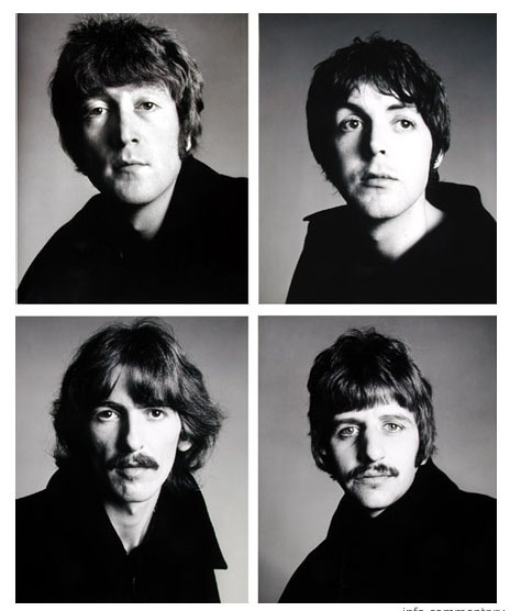
Richard Avedon's photography is a whole form of art itself.
He took portraits, but made them so much more than
just pictures. He captured emotion in black and white
better than anything I've ever seen. His signature look was
a white background. I love so many of his pictures,
because as he showed in the movie, every single one had a
story behind it.


My all time favorite picture by Richard Avedon is a portrait of
Marilyn Monroe.


In the video he explained how Marilyn Monroe wasn't a real girl. She was a fictional character made up by this girl, who appears sad and lonely, somewhat lost. I LOVE this picture because it's so different from every other Marilyn Monroe portrait. Avedon captured a moment where she wasn't the girl everyone saw her as, almost a completely different person.


These are a few of my other favorites by Richard Avedon


Thursday, October 29, 2009

IDIOMS!

To be honest I wasn't too excited about this project at first, but once I got one done I was wanting to do more. I just decided to have fun and I'm really liking my results.

*I got ideas for idioms from http://idiomsite.com/

"Apple of my eye"


Because of the fact that I did so many, I'm only going to explain what I did to one of the pictures, and leave the rest for your viewing pleasures :D
SO in this picture it's pretty obvious i cut the apple out and put it over the eye. I lowered the apple layer's opacity just a bit and also made some bite marks with the eraser tool just to make it more apple-ish i guess. I used a dark lens vingette and added a sepia photo filter.

"Charlie horse"
"Stick out like a sore thumb"

"Put your money where your mouth is"

"Don't count your chickens before they hatch"


Thursday, October 15, 2009

COLOR!

So one specific project I was assigned was to take pictures focusing on color. I decided to go with variations of color and the effects they have on the entire picture. For this picture, I went around in my backyard, trying to find something I could shoot that would be flexible as far as changing the mood of the picture.

After experimenting with random things in my yard, I decided on a flower because the colors in the picture already stood out to me before editing.
Original
Warm effect
In this, i increased the red and decreased blue to give the picture a warmer look. I also fixed the levels just a bit. I'm not too crazy about the warm look on this particular picture so after doing this I decided I'd try the opposite and see how that turned out.
Cool effect

For this one i increased blue and green mid tones. I increased the contrast a bit as well. I really like how this one turned out vs. the warmer look. I think the cooling effect gave the picture a really dramatic look.


---------
I seem to be behind on projects I did two projects in one week in order to get caught up
---------

Basic Studio Shots

Original // Edit


This is a picture I took last week and edited this week. I changed levels, burnt around the edges, and touched up his face.
*contact sheet for this on last post

Original // Edit

I think this one is more of a classic professional looking portrait. Unlike the first one, his body is at an angle, which I've found really does change the entire picture. In this i fixed the levels, touched up his face (gaussian blurred his face, toned down his 5:00 shadow and whitened his teeth) and also burnt around the edges to make him pop more. I really like how this one turned out.
*This is a picture i just took today, and didn't have time to get a contact sheet

Followers